Case Study
Building a Brand from the Ground Up
Overview
Marx Et Al is a Brooklyn-based lighting atelier with design references that span centuries—from Art Deco masters to Medieval illustrations. I drew from these exact same historical references to build their entire brand identity and content system from the ground up. The core of this work was about taking the lead designer’s raw vision and turning it into a fully realized public presence.
Role
Creative Director
Timeline
January 2025 → Present
Objective
To translate an artistic vision into a clean digital ecosystem that feels just as artful and archival as the physical objects—while ensuring branding continuity from an Instagram post down to a physical print asset.
Tools: Photoshop, Illustrator, Premiere Pro, InDesign, Figma, Edits, Custom CMS
Skills: Project Management, Content Creation, Graphic Design, Photography, Videography, Digital Asset Management
The Challenges
Because we were building this brand from the ground up, there was no predictable roadmap. We had to navigate and solve complex branding and asset challenges dynamically as they arose. This included learning a lot of new skills on a condensed timeline.
Another challenge was understanding lead designer’s vision as it evolved in real time so I could build an aesthetic that complimented the product and felt completely authentic to his vision.
The Roadmap
Initial Brand Benchmarking
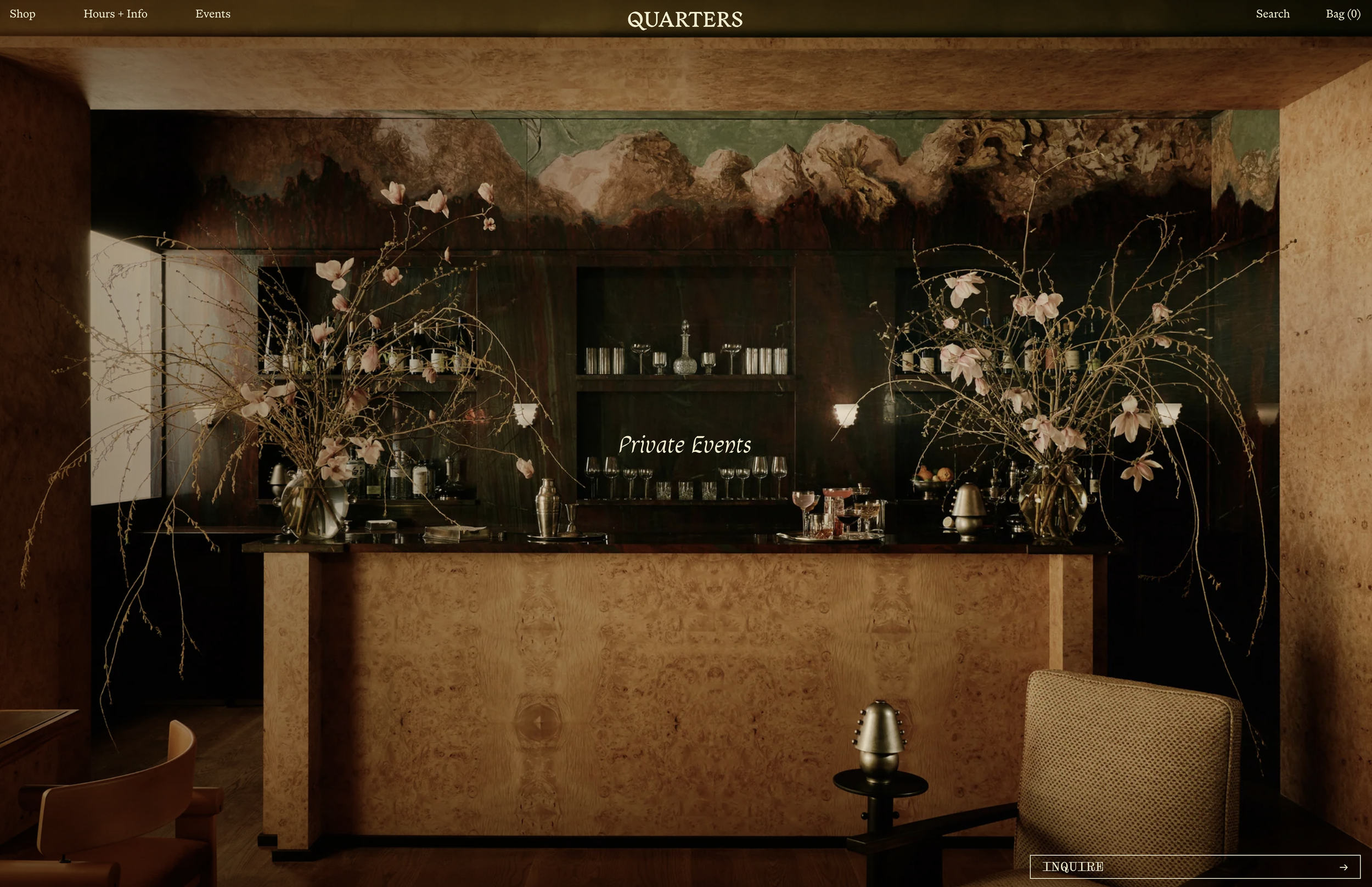
Inspiration 01: Quarters by In Common With
In Common With’s Quarters acts as a collaborative showroom, event venue, and bar, blending high-end design with a community-driven physical space.
Elements of this concept provided a blueprint for METAL to scale beyond lighting fixtures into furniture, objects, and full residential developments, integrating signature patina finishes directly into architectural details like entryway frames, cabinet hardware, or vanity mirrors.
Inspiration 02: L.E.J
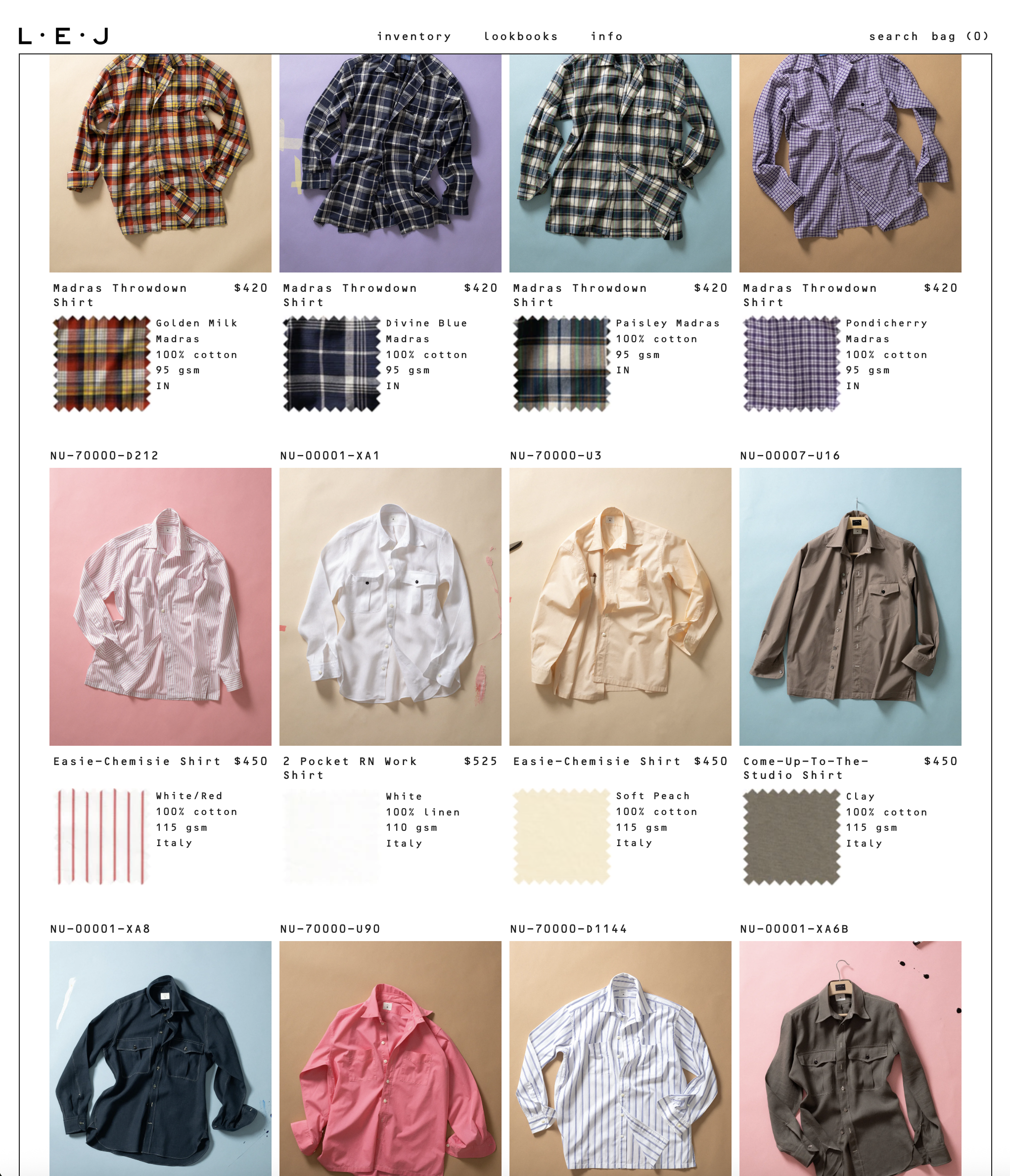
Digital-first menswear brand L.E.J pairs a cheeky, meandering copywriting style with stylized, louche imagery. By giving every fabric, pattern, and color variant its own dedicated product page, complemented by studio spec sheet descriptions and close-up fabric cutouts, the site builds an experience directly connected to the designer's cutting table.
This web architecture helped realize the METAL digital experience. Our copy is designed to be poetic and literary, channeling books that shaped Aaron’s vision, like A Dance to the Music of Time. Isolating each piece and finish on its own page introduced an elegant, intentional friction. Rather than distracting the user, it allows them to slow down, absorb the narrative, and treat each piece with the reverence of a standalone artifact.
Inspiration 03: BDDW
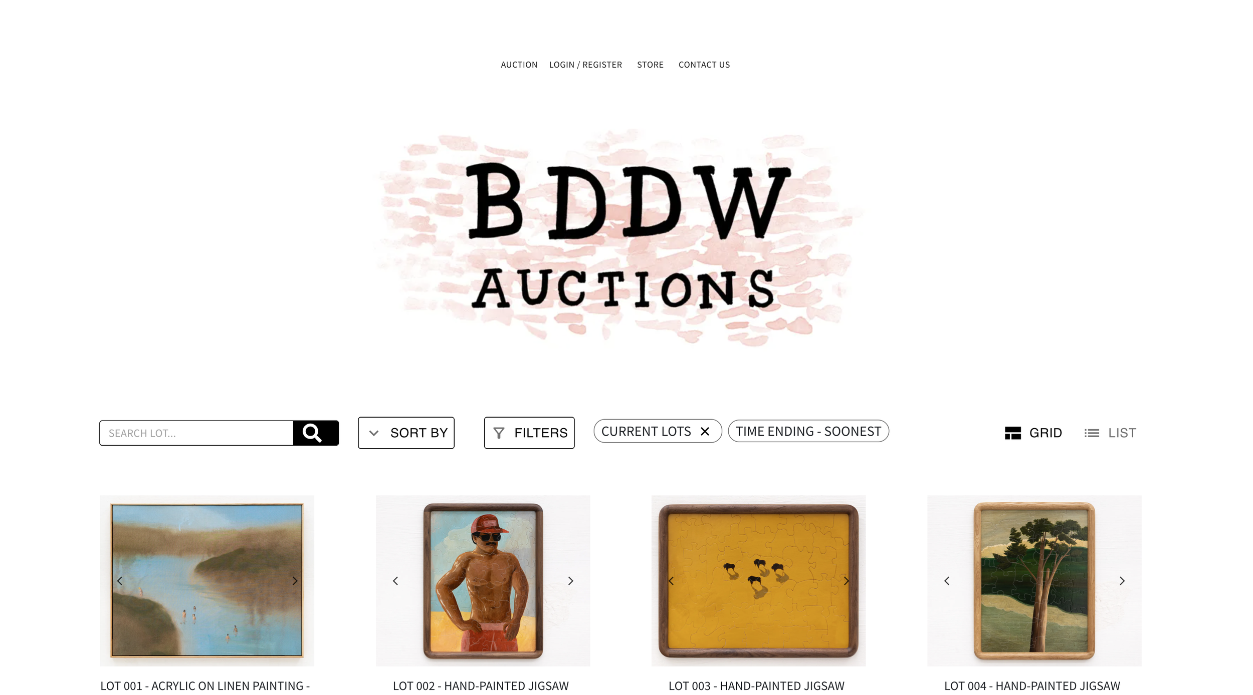
BDDW is a singular vision where designer Tyler Hays is entirely synonymous with the brand. We mirror this by elevating Aaron as the central creative force behind METAL, anchoring the brand identity to his hands-on involvement in the creation process.
Inspired by BDDW's model, co-founder Chris pushed for user-valued bidding to generate excitement around accessible entry points. This led to Fragments — a monthly auction platform for METAL to sell design experiments, prototypes, and character-rich, slightly flawed items.
Logo & Wordmark Development
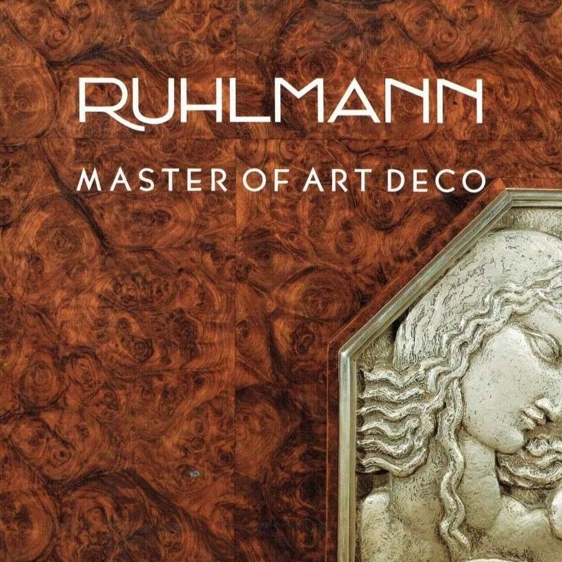
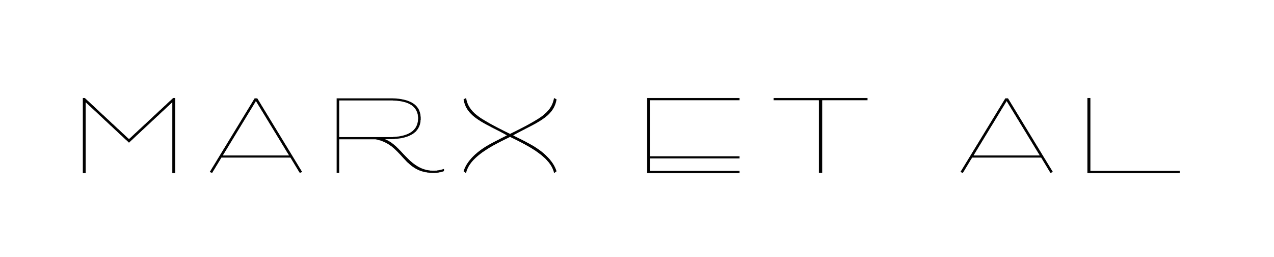
The custom wordmark draws direct inspiration from Art Deco pioneer Émile-Jacques Ruhlmann. It riffs on the wide, short proportions of the original Ruhlmann logo, but utilizes a significantly thinner weight to introduce a sleeker, more contemporary elegance.
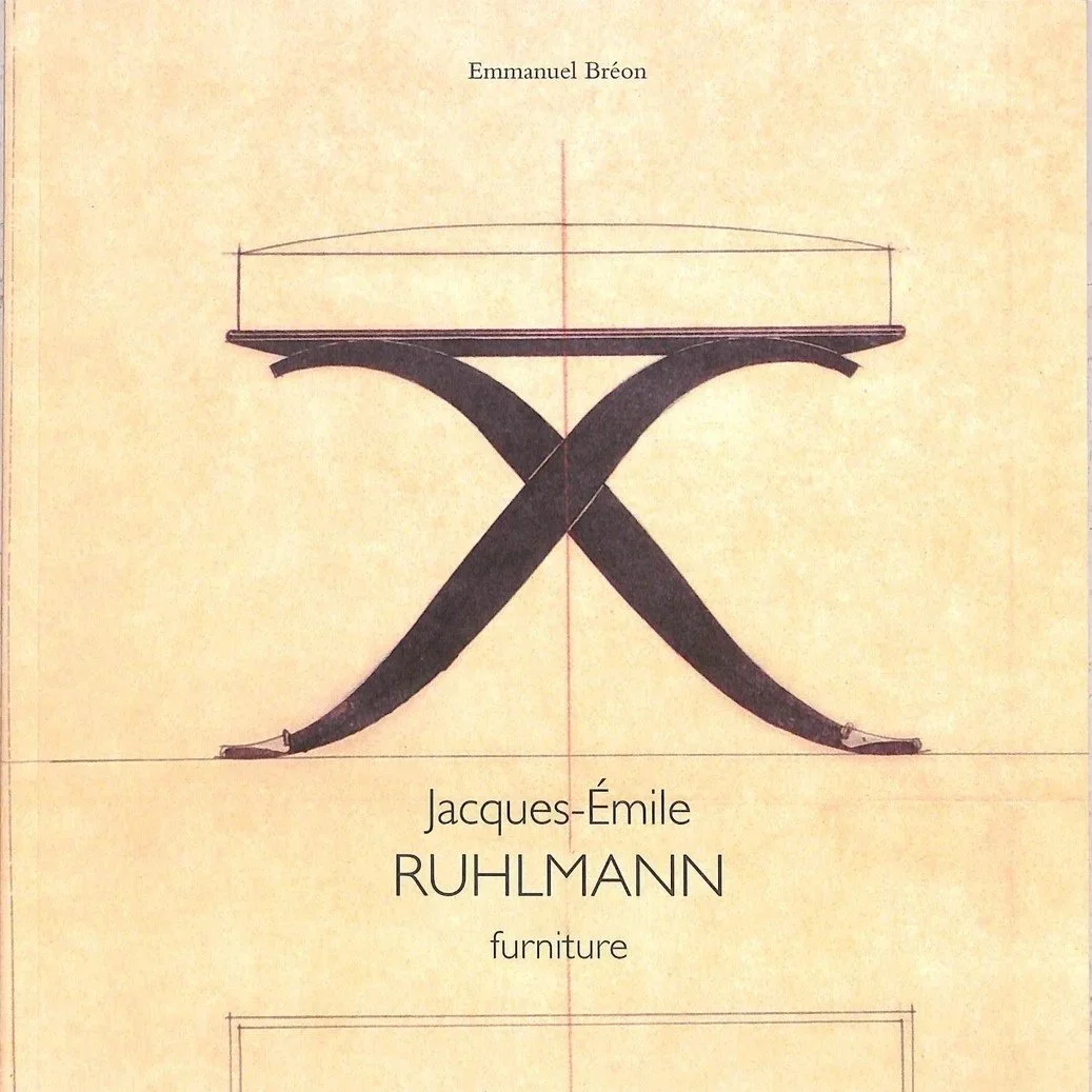
I wanted to keep the curve in the leg of the Ruhlmann wordmark, but knew it needed to be more dramatic to break up the linearity of the other letters. I was really struck by the swooping shape in this drawing, and used it to define the curve in our R.
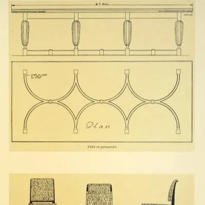
I wanted to curve the X to create another fluid break for the eye, but kept it distinct from the R. Using the drawing above, I found a similar shape that complements the R leg while mirroring the geometric X-bracing and structural motifs frequently seen throughout Ruhlmann's designs.
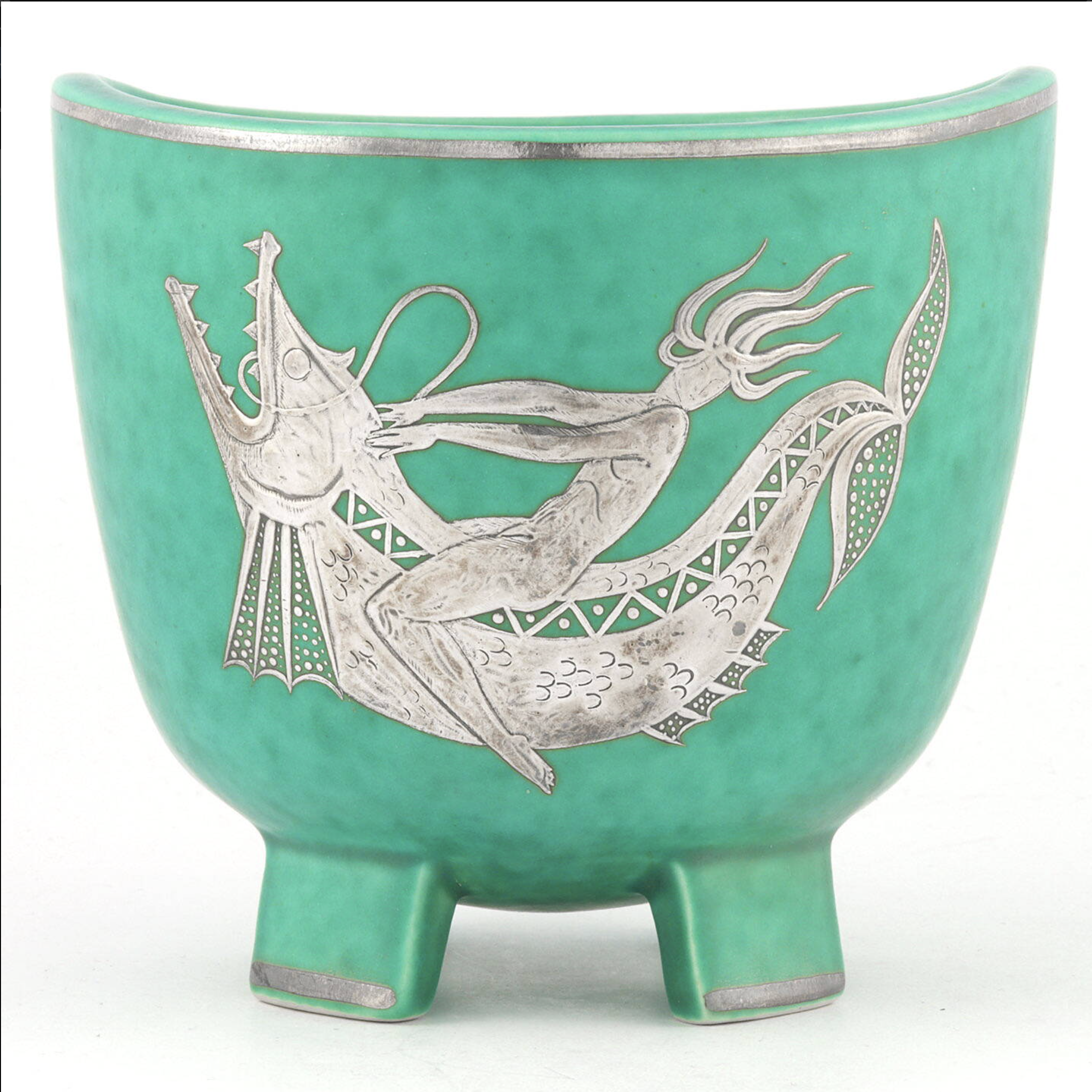
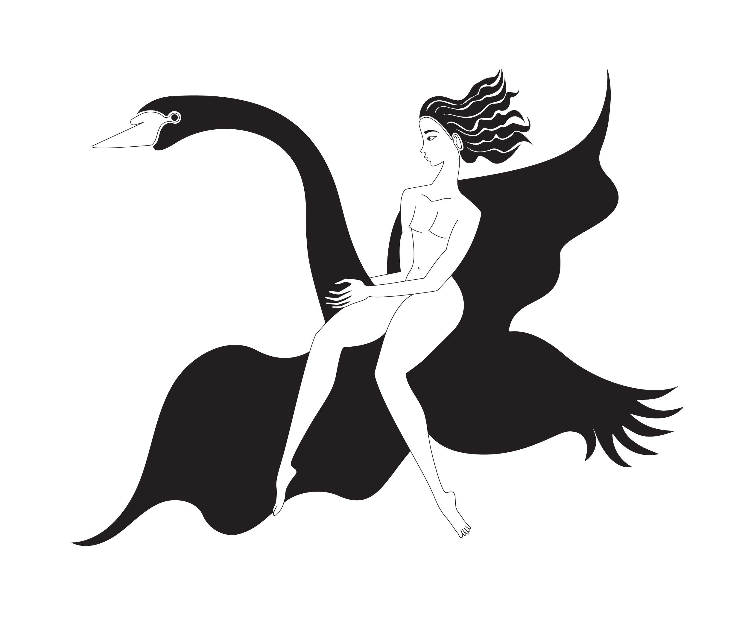
Another defining inspiration for the Marx Et Al vision was the figures seen in Wilhelm Kåge’s Argenta stoneware. The pieces clearly referenced historical elements like Greek red and black pottery, mixing a level of severity with whimsy to bring the visuals into an Art Deco context.
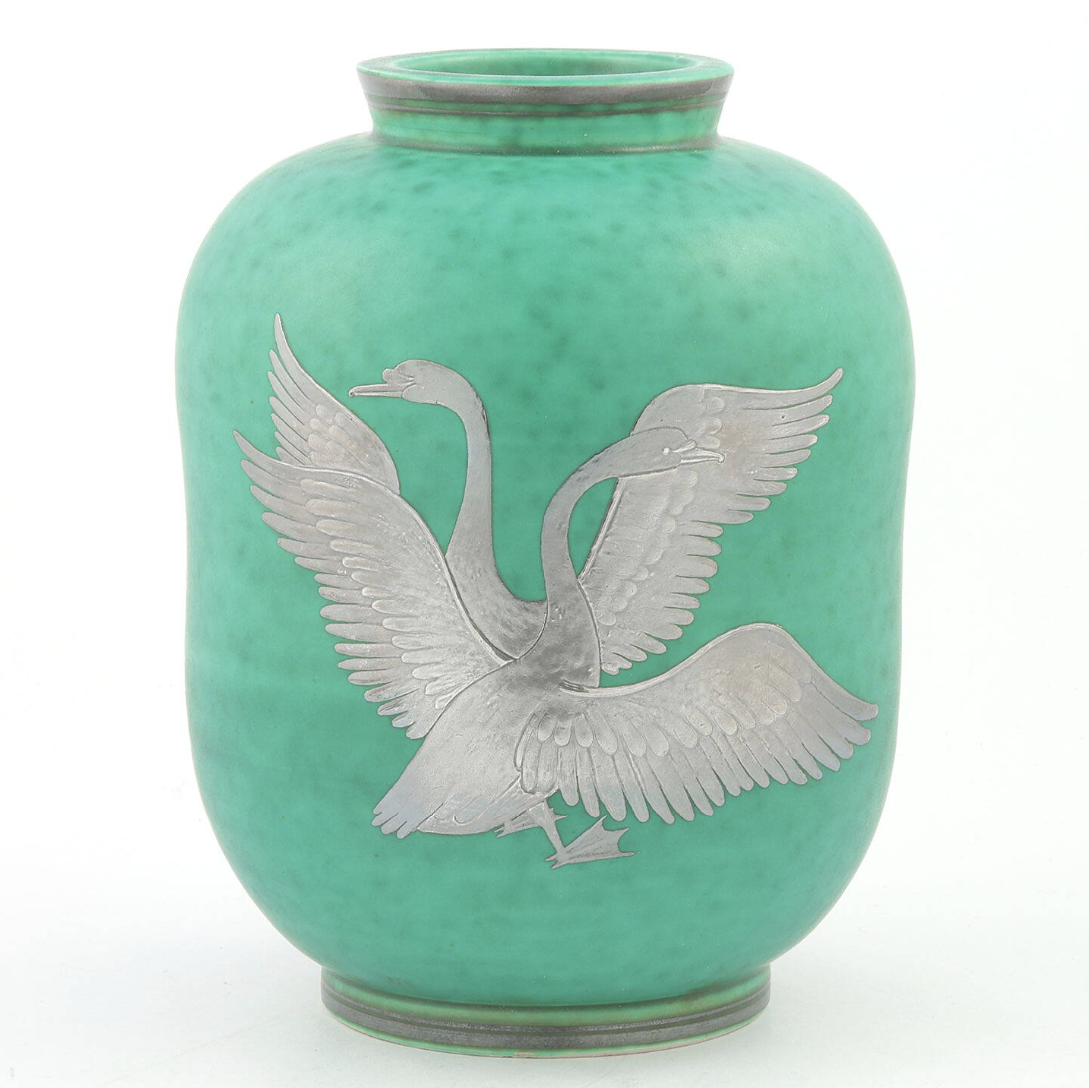
By removing a lot of the dense detail from the original Argenta figures, I was able to create a much more contemporary graphic. The core idea was to establish a clear through-line of history, tracing directly from the ancient reference all the way down to the final logo.
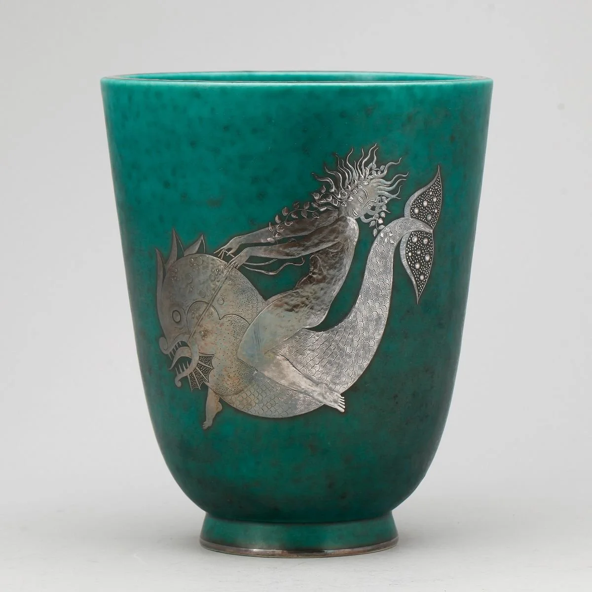
The swan was an excellent form to embrace those curvy lines, with the feathers coming to sharp points. Its expansive wings stretch the eye from one end of the logo to the other, and I looked at the hands, legs, and hair of the human-like figures riding creatures to capture how they created movement.
Evolution of the Content Workflow
Phase 01: Nothing but vibes to work with…
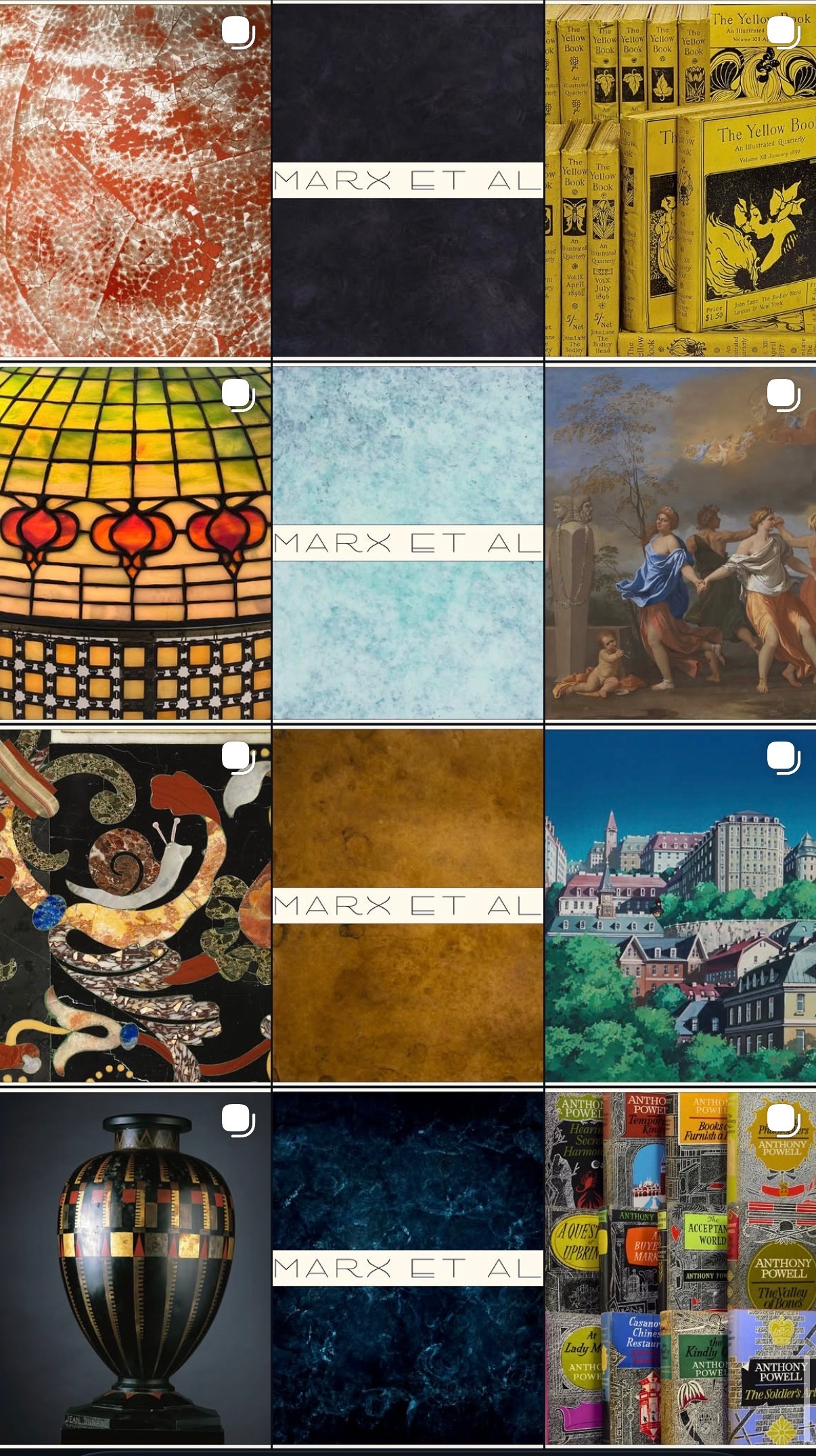
Before the physical products existed, our social account was purely mood-driven with a focus establishing a distinct aesthetic. The idea was this would prime our audience for what the brand would eventually become.
By this point we did have patina samples and the wordmark/logo to showcase. This is when I started developing the grid’s three-in-a-row system.
Phase 02: Prototype Era
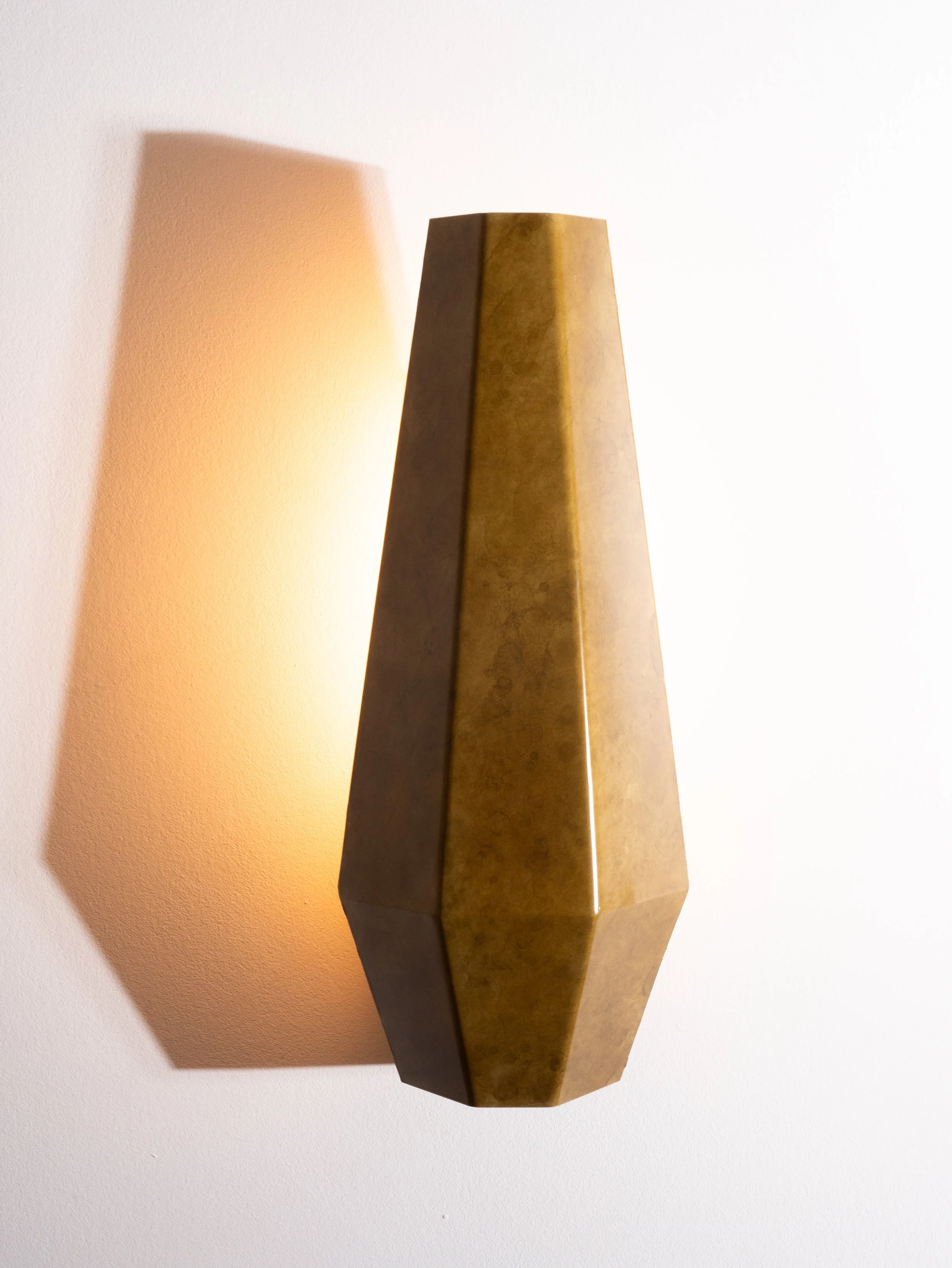
We had only four sconce prototypes fabricated for months, and the prototypes arrived with flaws like pooling patina, uneven edges, and the shades didn’t sit straight in the bases. This presented two challenges:
A lot of photoshopping and finessing the light and angles to make the sconces appear very different than they actually looked.
Product content was going to quickly become repetitive with only one type of light fixture to showcase.
To break up the sconce-heavy grid, I created stop-motion animations using our patina samples that had been used early in the grid. This playful, reel-friendly content did quite well, and turned manufacturing constraints into algorithm-optimized content.
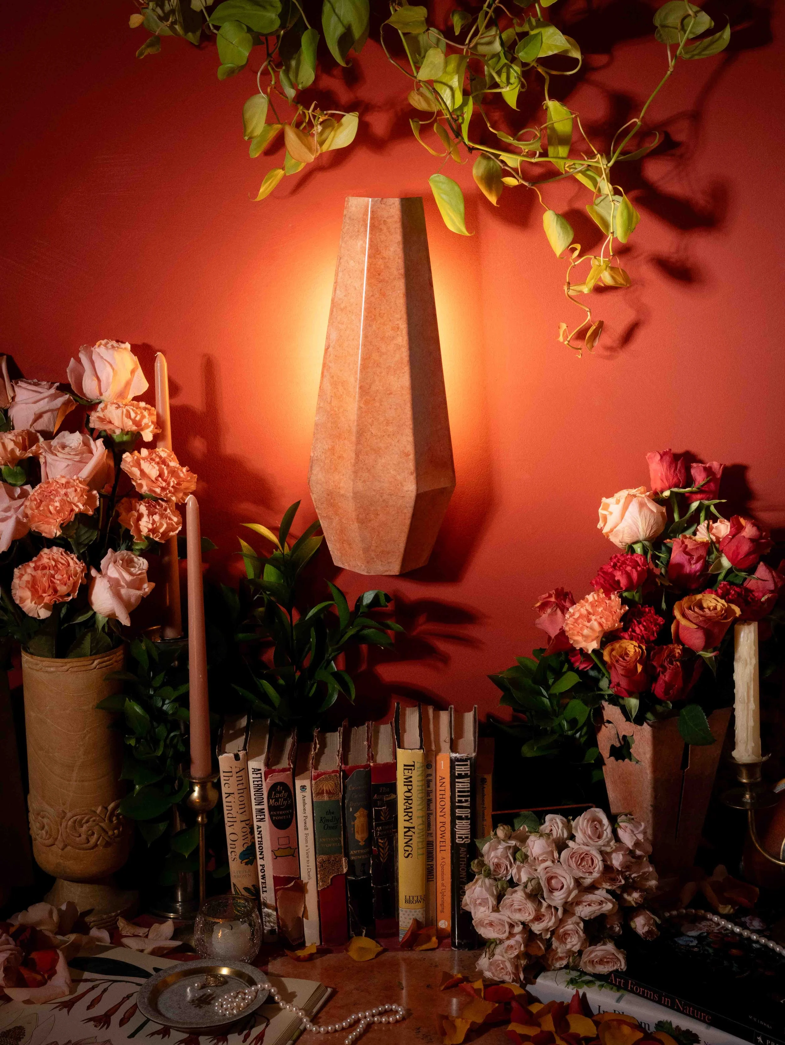
I also began to develop our signature still-life aesthetic, introducing curated props like books, jewelry, and florals. Since insitu was difficult to capture at this period, the still life kept the grid visually diverse and framed the sconces in a richer context.
Phase 03: Behind the Scenes
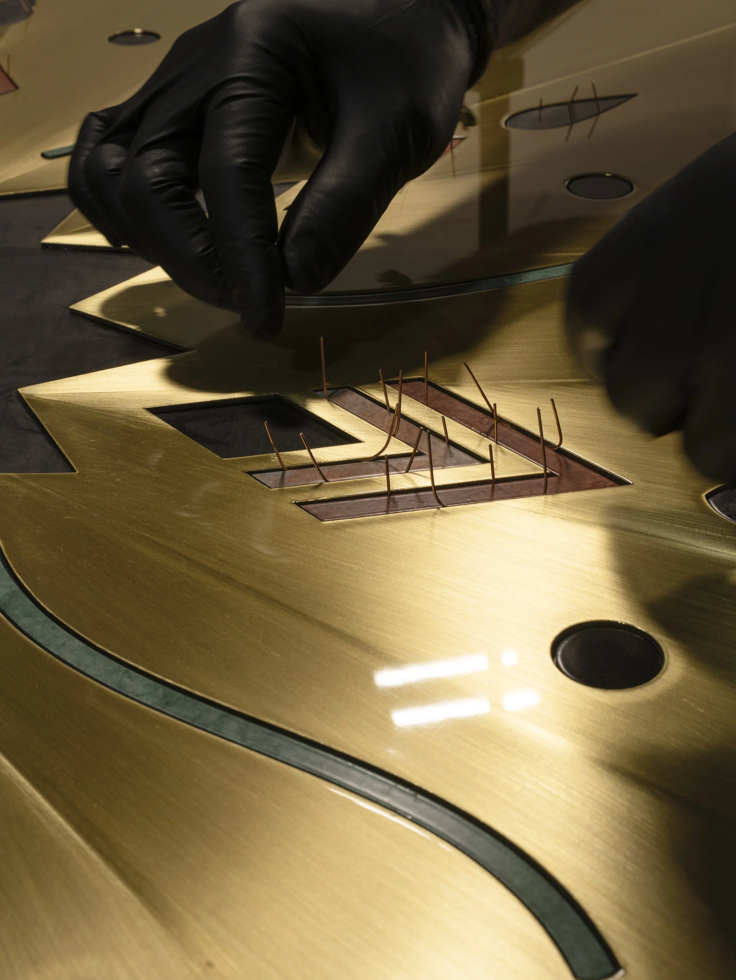
We didn’t want to neglect the behind-the-scenes fabrication process, but the raw in-shop content definitely wasn’t polished enough to live on our highly curated grid. To bridge that gap, I started using Stories to share what was happening in the shop in real time.
This kept the main feed consistent while giving us place to test how we wanted to "talk" to our audience. The aim was for casual content to still feel intentional. The bts content performed quite well, so the budget shifted to prioritize getting a camera into the shop. I was able to take more professional photos, and we moved bts onto the main grid to more formally show our fabrication process.
Phase 04: ICFF Launch
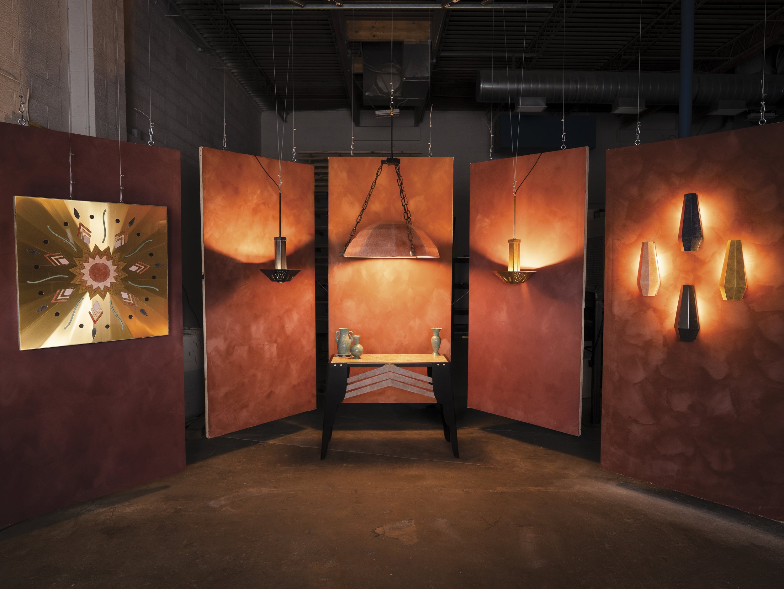
Participating in the 2026 International Contemporary Furniture Fair (ICFF) was always our target for the official brand launch. About two months out, production exploded from zero to a hundred. I shifted from repurposing existing media assets to producing and distributing a massive influx of new images, videos, and interviews, balancing shooting, editing, and posting cadences.
Because the debut collection was shipping straight from the fabrication shop in Colorado to the Javits Center in New York, we couldn't use our usual basement studio setup. Instead, I had to build an impromptu photo studio directly in the Colorado shop to capture the final product photos for our print materials and digital assets before everything was boxed up and shipped out.
Phase 05: Refining the Workflow
Looking forward to this November, we are heading to the Collectible Fair. With the runway to plan months in advance, our upcoming strategy focuses on three initiatives: expanding our high-performing still-life imagery for Instagram ads, introducing lighting into the auctions to make the brand accessible to enthusiasts normally priced out, and showcasing new patinas to drive physical sample sales directly to designers.
Reflections
Networking Momentum
The real brand velocity has been driven by merging in-person and digital networking. Documenting gallery openings, tagging collaborators, and actively reposting peer designers built the foundational relationships that set the company in motion.
BTS Buy-In
High-end styling attracted users, but behind-the-scenes content has driven the deepest audience engagement. Showing the unpolished reality of the shop floor—like the custom chemical patina process or the hand-assembly of the Deco Panel 001—became our highest impression social content.
Resourcefulness
Resourcefulness was the most critical skill I had to lean on. Some examples of how we produced the high-end editorials in a basement and fabrication shop include: built rollable backdrops with J-boxes to power the fixtures, hung limewash-painted drywall from the shop ceiling, and blacked out windows with cardboard to control the light.