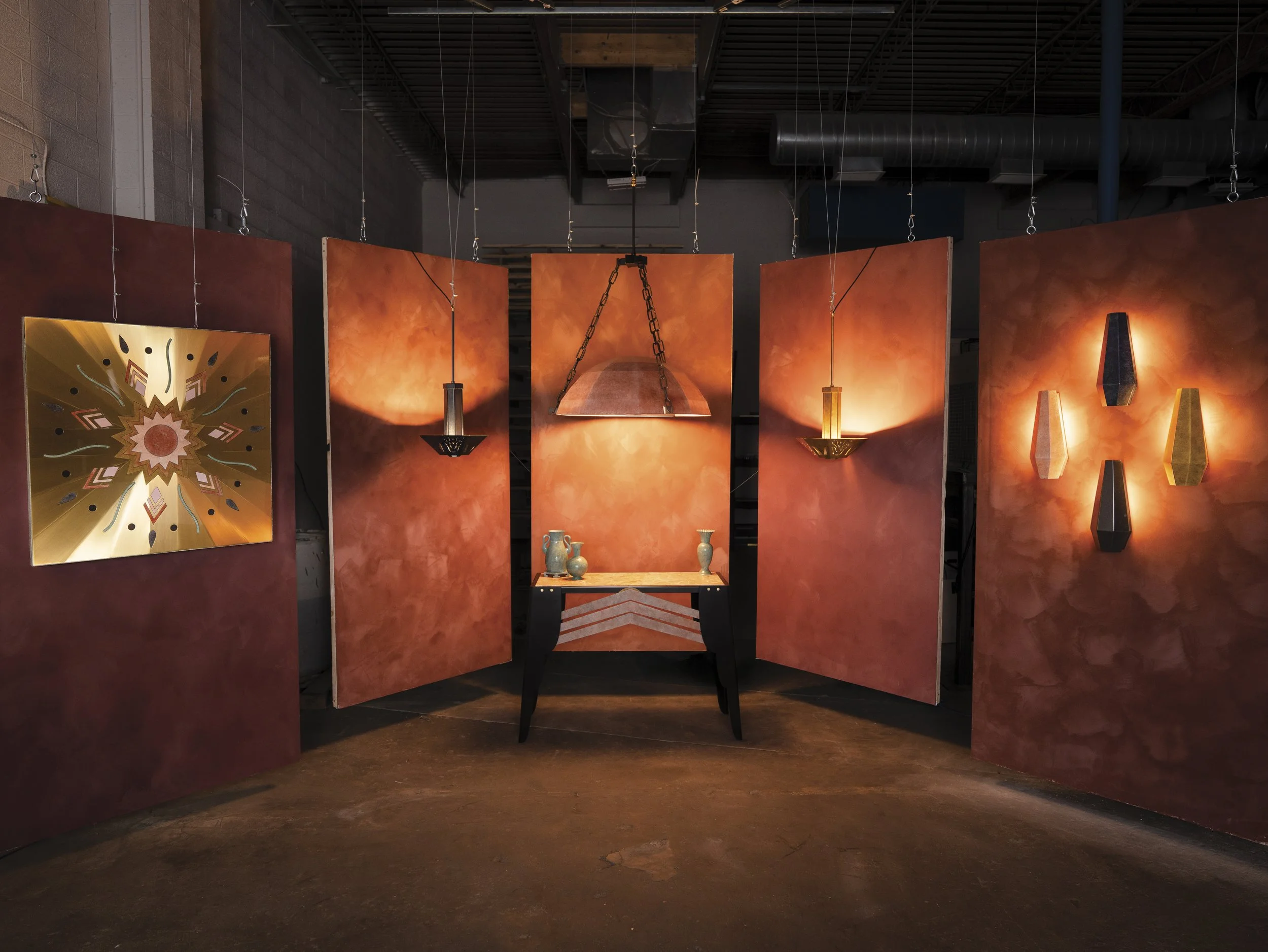
Case Study 02
Building METAL's Brand & Content Systems
Overview
Marx Et Al is a Brooklyn-based lighting atelier that I co-founded in 2025. This case study covers the development of digital workflows, structures, and standards leading up to the company’s official launch at ICFF in 2026.
The core of my work was taking the founder’s raw vision and turning it into a fully realized public presence, starting at the content production level and growing into owning the company's full brand, content, and digital strategy, and building a foundation of systems that let one evolving creative vision scale across a growing catalog of products and channels.
Role
Content Designer & Strategist
Timeline
January 2025 → Present
Tools
Claude, Gemini, Photoshop, Illustrator, Premiere Pro, InDesign, Figma, Edits, Sanity CMS
Skills
Content Auditing & Competitive Analysis, Content Governance & Style Guide Development, Content Creation: Graphic Design, Photography, and Videography
The Challenge
Because we were building both the brand and its content system from the ground up, there was no existing playbook. No style guide, no established workflow, no answer key yet for what "on-brand" meant. The lead designer's vision was evolving in real time, which meant the standards I was building couldn't just be locked in once and enforced. They had to evolve with him while still giving the content system enough structure to stay consistent from an Instagram caption to a 404 page to a printed booklet.
This brand building included teaching myself a handful of production skills on-the-fly:
DIY studio construction and lighting rigging
On-the-fly studio setups in a working fabrication shop
Video/photo production at volume — shooting, editing, and posting cadence
Logo and wordmark design
Stop-motion animation
Initial Brand Benchmarking
-
In Common With’s Quarters acts as a collaborative showroom, event venue, and bar, blending high-end design with a community-driven physical space.
Elements of this concept provided a blueprint for METAL to scale beyond lighting fixtures into furniture, objects, and full residential developments, integrating signature patina finishes directly into architectural details like entryway frames, cabinet hardware, or vanity mirrors.
-
Digital-first menswear brand L.E.J pairs a cheeky, meandering copywriting style with stylized, louche imagery. By giving every fabric, pattern, and color variant its own dedicated product page, complemented by studio spec sheet descriptions and close-up fabric cutouts, the site builds an experience directly connected to the designer's cutting table.
This web architecture helped realize the METAL digital experience. Our copy is designed to be poetic and literary, channeling books that shaped Aaron’s vision, like A Dance to the Music of Time. Isolating each piece and finish on its own page introduced an elegant, intentional friction. Rather than distracting the user, it allows them to slow down, absorb the narrative, and treat each piece with the reverence of a standalone artifact.
-
BDDW is a singular vision where designer Tyler Hays is entirely synonymous with the brand. We mirror this by elevating Aaron as the central creative force behind METAL, anchoring the brand identity to his hands-on involvement in the creation process.
Inspired by BDDW's model, co-founder Chris pushed for user-valued bidding to generate excitement around accessible entry points. This led to Fragments — a monthly auction platform for METAL to sell design experiments, prototypes, and character-rich, slightly flawed items.
Asset Development
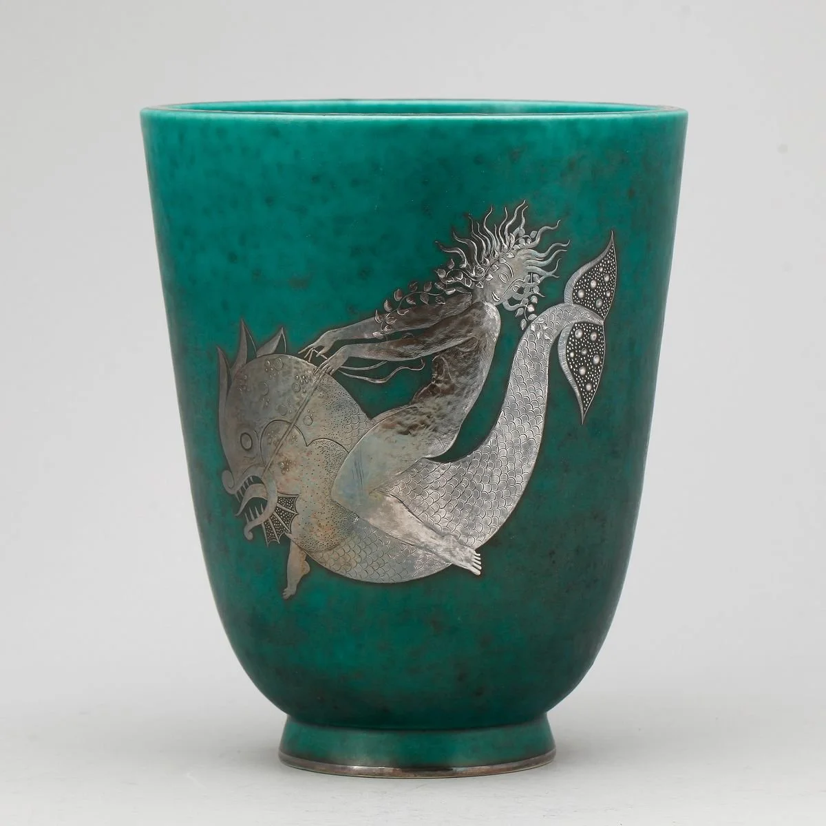
The custom wordmark and logo draw direct inspiration from Art Deco pioneer Émile-Jacques Ruhlmann and the figures in Wilhelm Kåge's Argenta stoneware, tracing a clear through-line from historical reference to final logo. the mark reworks Argenta's severity-and-whimsy figures, a swan drawn from the same source, into a simplified, contemporary graphic.
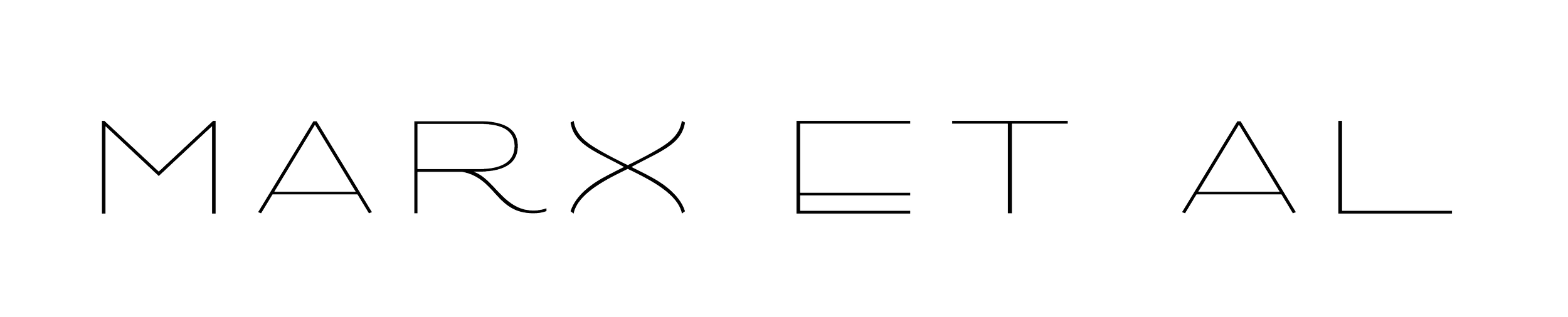
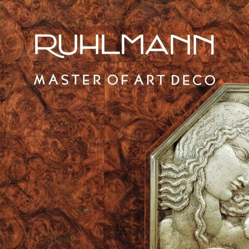
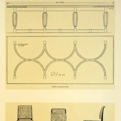
The wordmark riffs on Ruhlmann's wide, short proportions in a thinner, more contemporary weight
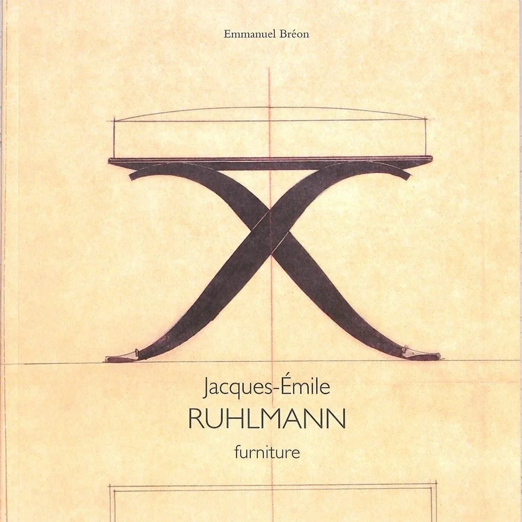

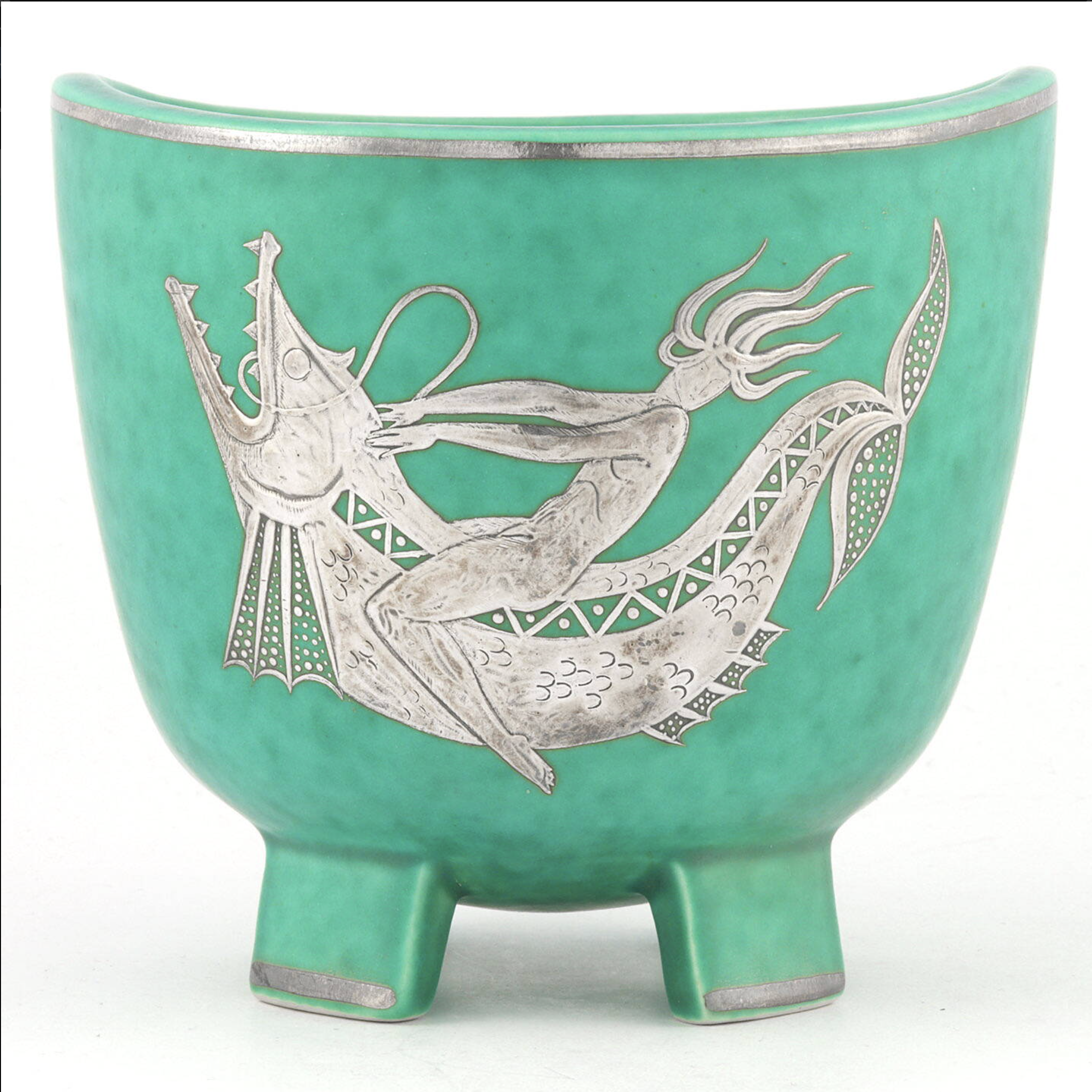
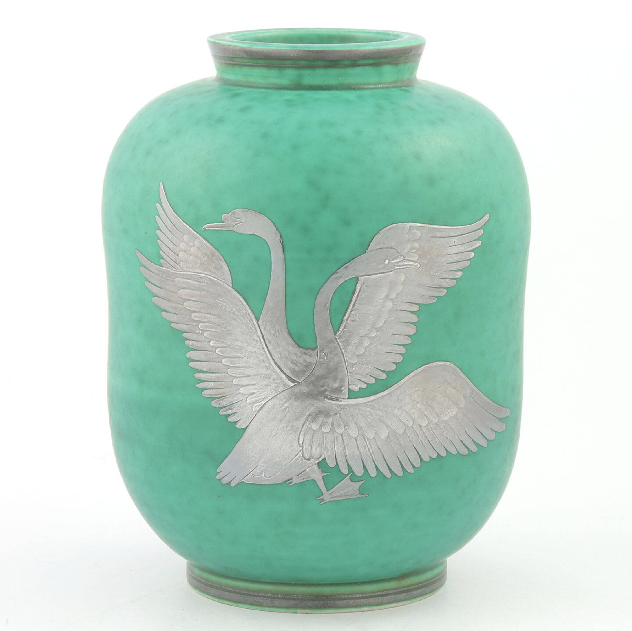
The logo reworks the severity-and-whimsy figures of argenta into a simplified, contemporary graphic.
Content Pipeline Evolution
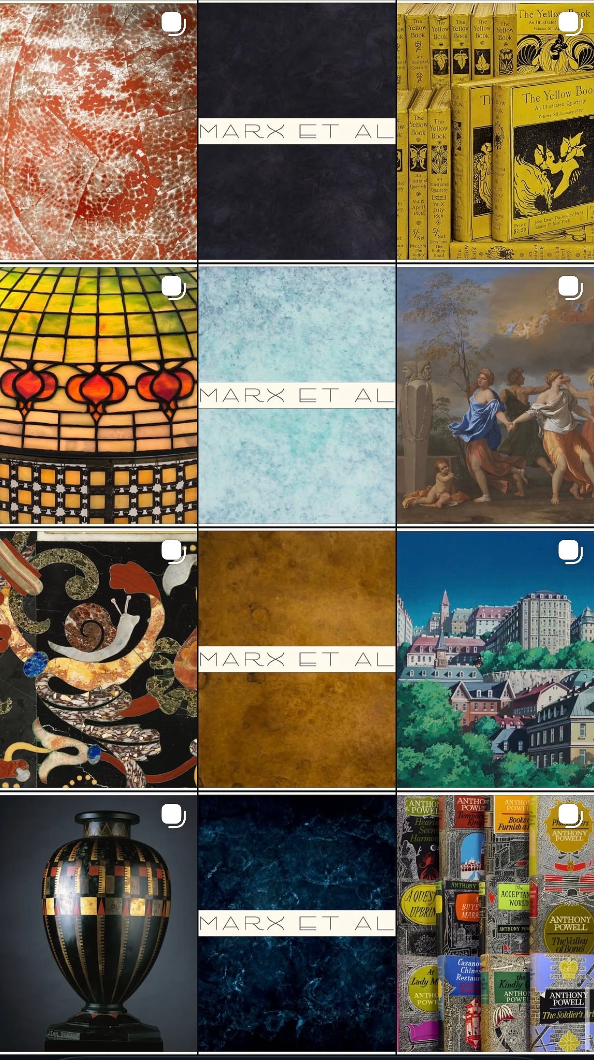
Phase 01: Nothing but vibes to work with…
Before the physical products existed, our social account was purely mood-driven with a focus establishing a distinct aesthetic. The idea was this would prime our audience for what the brand would eventually become.
By this point we did have patina samples and the wordmark/logo to showcase. This is when I started developing the grid’s three-in-a-row system.
Phase 02: Prototype Era
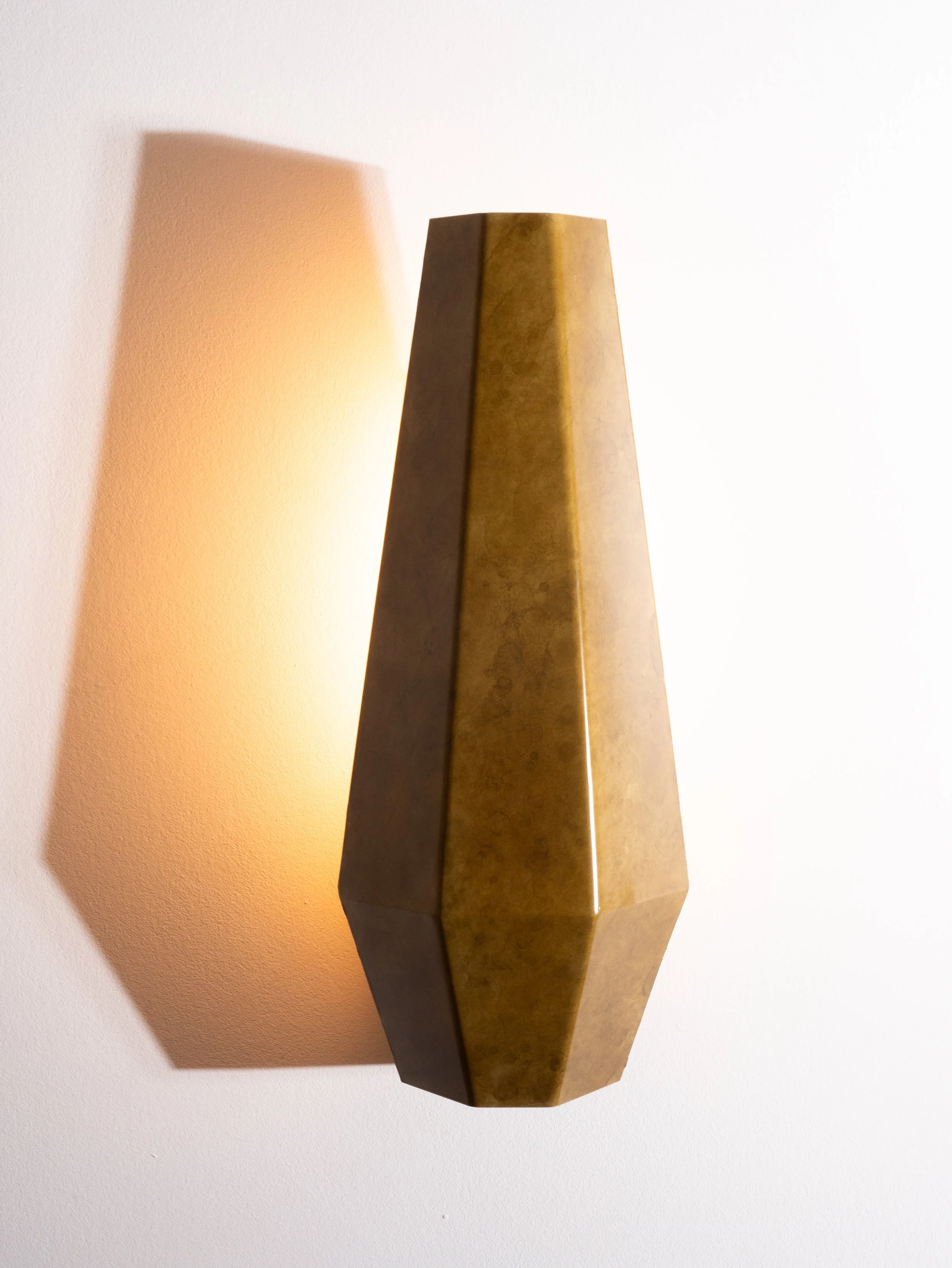
The content system had to make an inconsistent product look consistent before the product itself was. We had only four sconce prototypes fabricated for months, and they arrived with real flaws, pooling patina, uneven edges, shades that didn't sit straight in their bases. That created two new challenges to find solutions for:
A lot of photoshopping and finessing the light and angles to make the sconces read as more finished than they actually were.
Approach: I created stop-motion animations using our patina samples that had been used early in the grid. This playful, reel-friendly content did quite well, and turned manufacturing constraints into algorithm-optimized content.
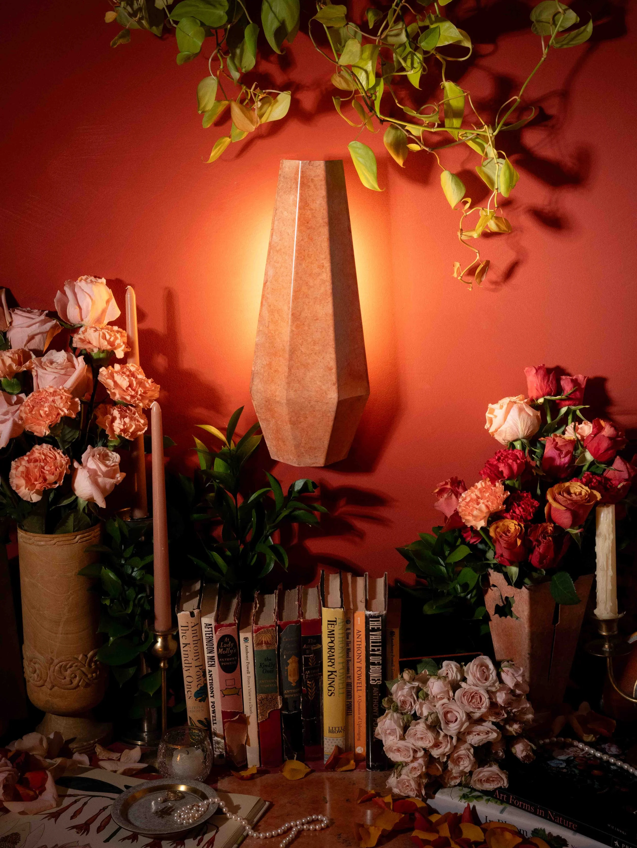
Content that risked going repetitive fast with only one type of fixture to shoot.
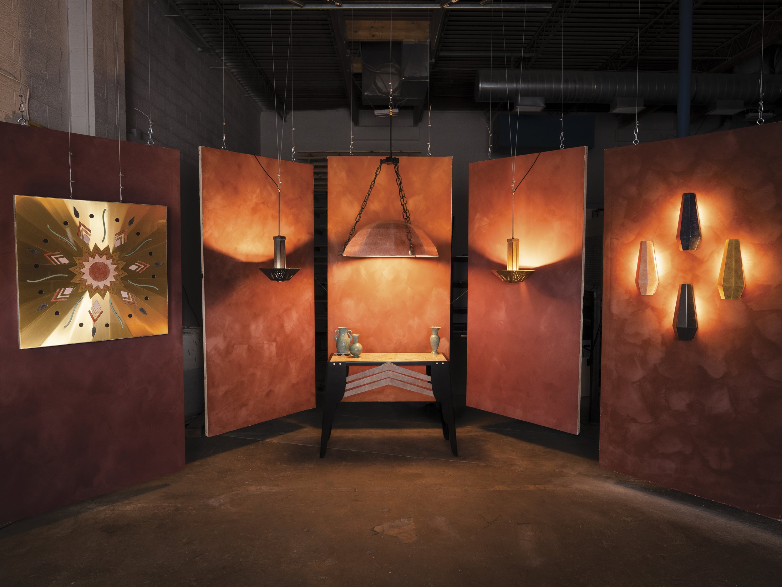
Approach: I also began to develop our signature still-life aesthetic, introducing curated props like books, jewelry, and florals. Since in situ was difficult to capture at this period, the still life kept the grid visually diverse and framed the sconces in a richer context.
Phase 03: Behind the Scenes
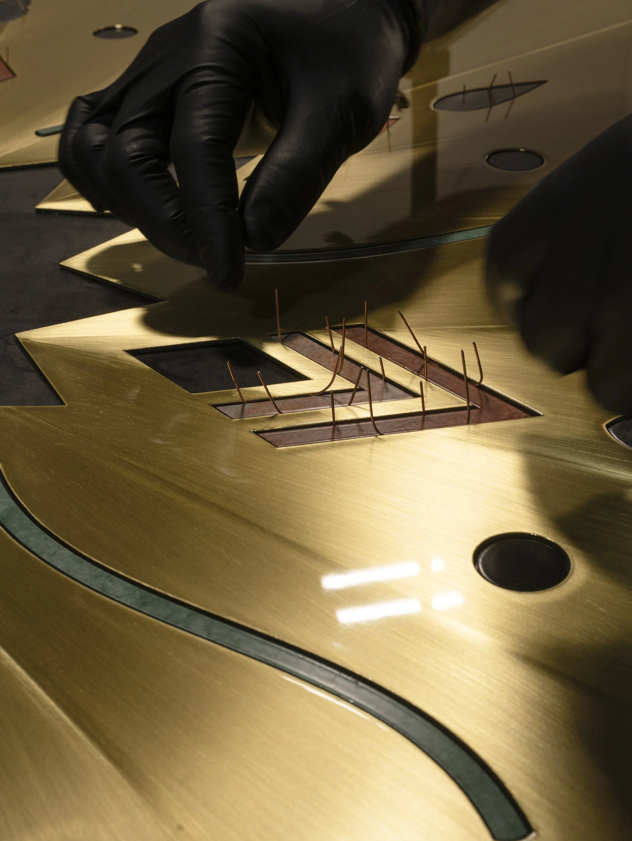
We didn’t want to neglect the behind-the-scenes fabrication process, but the raw in-shop content definitely wasn’t polished enough to live on our highly curated grid. To bridge that gap, I started using Stories to share what was happening in the shop in real time.
This kept the main feed consistent while giving us place to test how we wanted to "talk" to our audience. The aim was for casual content to still feel intentional. The bts content performed quite well, so the budget shifted to prioritize getting a camera into the shop. I was able to take more professional photos, and we moved bts onto the main grid to more formally show our fabrication process.
Phase 04: ICFF Launch
Participating in the 2026 International Contemporary Furniture Fair (ICFF) was always our target for the official brand launch. About two months out, production exploded from zero to a hundred. I shifted from repurposing existing media assets to producing and distributing a massive influx of new images, videos, and interviews, balancing shooting, editing, and posting cadences.
Because the debut collection was shipping straight from the fabrication shop in Colorado to the Javits Center in New York, we couldn't use our usual basement studio setup. Instead, I had to build an impromptu photo studio directly in the Colorado shop to capture the final product photos for our print materials and digital assets before everything was boxed up and shipped out.
Pre-Launch Website Audit
With ICFF approaching, the website needed to be live so press and buyers had something real to reference beyond the booth. That deadline turned this into a structured audit, benchmarking against comparable brands with solutions already in place. Below are some of my critiques of the site by section, each followed by the reasoning behind the change.
-
Home, Trade, and Cart were listed as top-level menu items, duplicating what the logo, header icon, and footer already handled. Redundant nav adds clutter, not clarity, especially for Cart, which is conventionally an icon, not a label.
Removed all three from the main menu, keeping them where users' mental models already expected them.
Shipping & Returns didn't exist on the site, despite being one of the first pages users look for when something's gone wrong.
Added it to the footer with other informational pages.
-
Homepage feature cards were pulling directly from the first and second product images in the CMS, with no separate homepage-specific field. Product images are built to sell one item; homepage images need to work editorially, setting a tone rather than a spec.
Gave the homepage its own image field in the CMS, independent of the product fields, for more visual flexibility.
The layout also had no way to handle cropping across screen sizes, one image, one crop, regardless of device.
Added a separate mobile image field in the CMS, so mobile could show a vertically oriented image built for smaller screens instead of a stretched or awkwardly cropped desktop one.
-
The price was baked into the button copy itself instead of being its own listed item. When a product's CTA wasn't present, like on Corot, the price disappeared along with it.
Pulled the price out as its own field, separate from the button.
The CMS couldn't structure copy beyond plain text: no line breaks, no HTML, no rich text option at all. Bold and italic can seem like trivial functions, but they carry real weight in web copy.
Added rich text to every description field.
Products had no defined set of specifications, downloads, or drawings, just an above-the-fold overview meant for a quick read. Designers needed a deeper layer of detail without leaving the page.
Added a toggle between critical specs and a product drawing, so users could switch between both without scrolling or opening the tear sheet PDF.
-
Samples were the only product on the site you could actually purchase directly, but there was no connection to the benefits of the trade program, like samples coming complimentary with it, so there was no reason for a visitor to log in or sign up before checking out.
Added that benefit directly to the sample flow, plus an "order a sample" button and a hover state so the description sits over the image at the point of action instead of buried below it.
-
Currently, the only use for the account is to change login credentials. There is no sections for past orders, address, payment information, inquires, order tracking, etc.
We need to define the purpose of this feature. If it is only for the trade program, that’s fine, but it isn’t apparent at the moment.
-
The trade page is the start of a partnership and a vital customer touchpoint, but it listed no benefits or incentives for joining — nothing telling a prospective partner why they should do this before asking them to.
The flow also didn't invite the user in. Leading with "make an account" before anything else is an aggressive first ask for someone who's just inquiring about the program.
Added in introduction about the benefits and why to join, then guided them into the form.
-
Error states on the password field gave no way to check what was actually typed, so a user who got it wrong had no quick way to see why.
*Added a visibility toggle to the password field.
Account creation also didn't tell the user there was another step to take. Without a message, nothing signaled that verification was required before they could do anything else on the site.
Added a confirmation screen — Title: "One more step…" Message: "Thanks for creating an account with us, First Name! A verification code has been sent to [youremail@email.com](mailto:youremail@email.com)." This lets the user know they can't take further action until verification is complete.
As METAL grew, so did the volume of content we needed to produce and manage, especially with an ongoing back-and-forth of physical items between the Colorado shop and the NYC studio, so I started building systems to govern and track it.
This shot list inventory is one example of a database I built.
Content Governance System
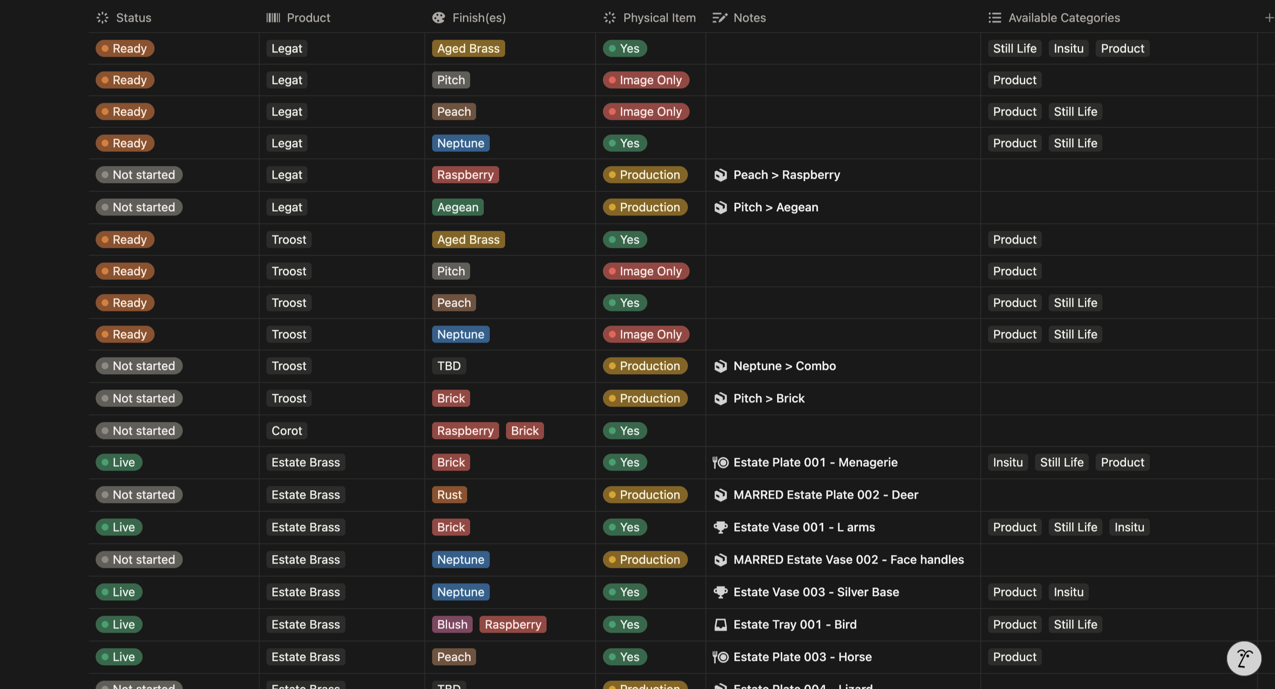
Status - tracks where each item sits in the pipeline
Not started - content creation isn't happening yet, the piece is still in the shop or doesn't exist
Production - being photographed and edited
Ready - ready for the website
Live - live on the website
Product - naming convention for the items
Finish(es) - naming convention for inventory of product finishes
Physical Item - tracks if the physical piece still exists in that finish, is it currently being made, or is it now an image only inventory
Notes - production notes for the shop or context on status (why an item is Not Started, Ready…)
Available Categories - any image types that exist for this product/finish combination
Product image — required for every item
Still Life / Insitu image — additional types used on socials, print, emails etc.
Impact & Takeaways
Resourcefulness as a Tool for Growth
A lot of this work meant learning things I didn't already know how to do, on a timeline that didn't leave room to learn them first. I used AI to brainstorm approaches and prototype ideasm and tutor me through unfamiliar tools/software and troubleshoot when I got stuck. I was able to turn Claude and Figma Make into a part of my workflow as a co-founder. In the end, resourcefulness itself was the best tool I had.
Working Across the Design-Dev Divide
The web audit meant collaborating closely with the developer to actually build each fix — walking through solutions together instead of just handing off a list of problems, and bringing my own ideas to the brainstorming sessions. A lot of that work was learning to make the case for messaging and copy placement to someone who thinks in functionality, not content — showing why where a sentence sits, or whether a field even has a label, is as much a design decision as the layout around it.